A Simple Trick to Make The Most Out of Pivot Tables in Pandas
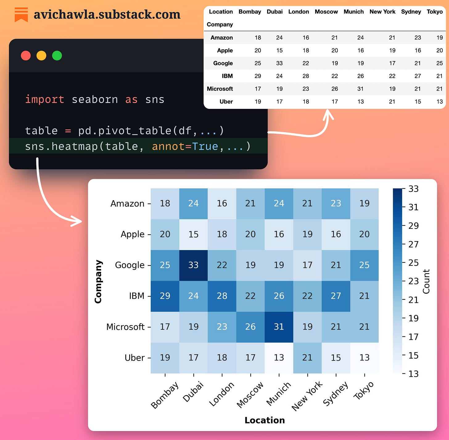
Pivot tables are pretty common for data exploration. Yet, analyzing raw figures is tedious and challenging. What's more, one may miss out on some crucial insights about the data.
Instead, enrich your pivot tables with heatmaps. The color encodings make it easier to analyze the data and determine patterns.
Read a detailed guide on pivot tables by Mito, a spreadsheet interface for Pandas, here: Pivot Table Blog.
Share this post on LinkedIn: Post Link.
Check out Sourcery, an automated code refactoring tool for Python.
Find the code for my tips here: GitHub.
I like to explore, experiment and write about data science concepts and tools. You can read my articles on Medium. Also, you can connect with me on LinkedIn.


