
An Underrated Technique To Create Better Data Plots

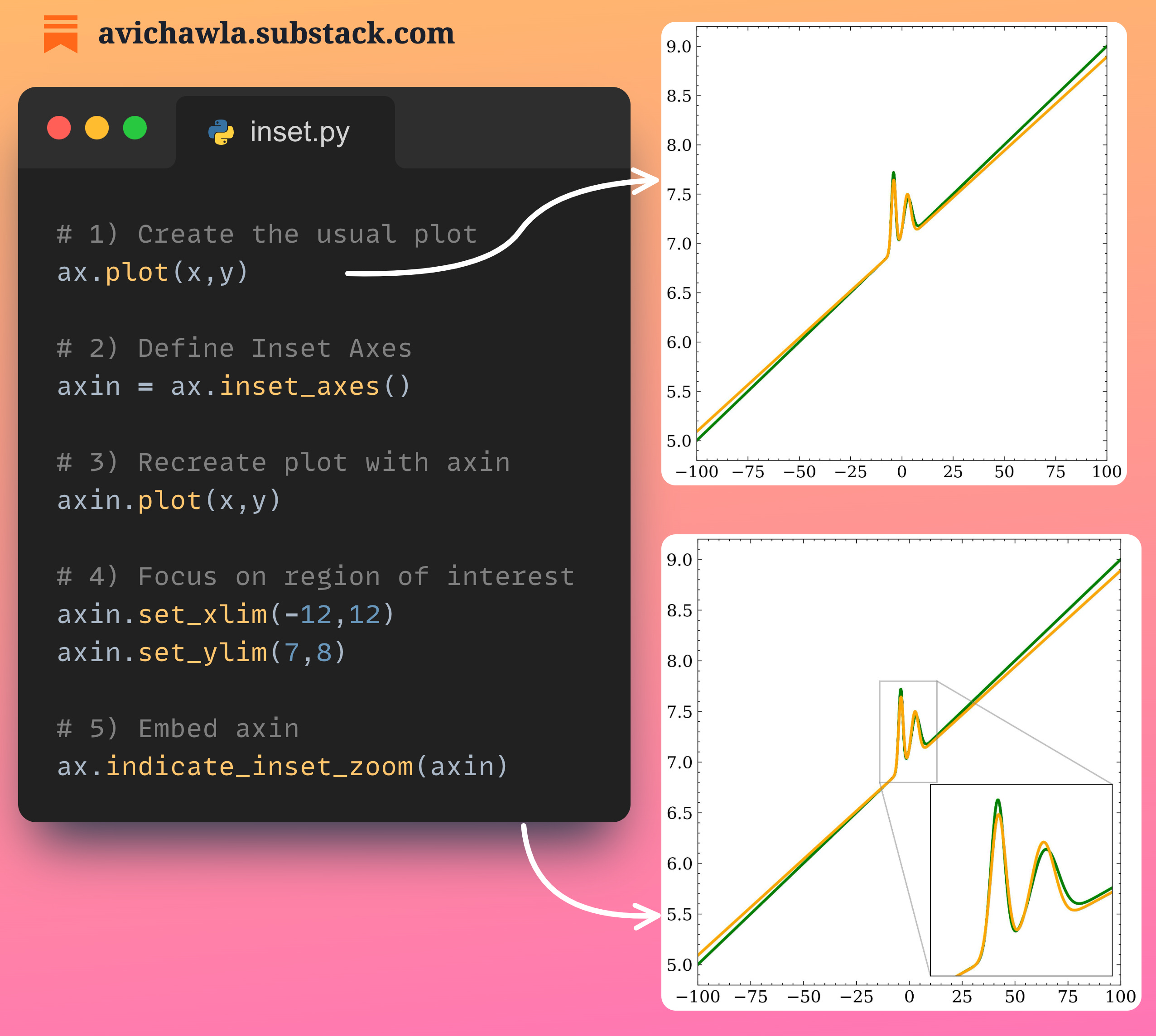
While creating visualizations, there are often certain parts that are particularly important. Yet, they may not be immediately obvious to the viewer.
A good data storyteller will always ensure that the plot guides the viewer's attention to these key areas.
One great way is to zoom in on specific regions of interest in a plot. This ensures that our plot indeed communicates what we intend it to depict.
In matplotlib, you can do so using 𝐢𝐧𝐝𝐢𝐜𝐚𝐭𝐞_𝐢𝐧𝐬𝐞𝐭_𝐳𝐨𝐨𝐦(). It adds an indicator box, that can be zoomed-in for better communication.
Find more info here: Matplotlib docs.
Share this post on LinkedIn: Post Link.
Hi there!
I am planning to start my personal blog where I will host long-form content such as blogs and courses. Would you be interested in reading more of my work?
Find the code for my tips here: GitHub.
I like to explore, experiment and write about data science concepts and tools. You can read my articles on Medium. Also, you can connect with me on LinkedIn.