Daily Dose of Data Science

Share this post

Create A Racing Bar Chart In Python

www.blog.dailydoseofds.com

Discover more from Daily Dose of Data Science

High-quality insights on Data Science and Python, along with best practices — shared daily. Get a 550+ Page Data Science PDF Guide and 450+ Practice Questions Notebook, FREE.
Over 36,000 subscribers
Continue reading
Sign in

Create A Racing Bar Chart In Python

Avi Chawla
Jan 2, 2023
6
Share this post

Create A Racing Bar Chart In Python

www.blog.dailydoseofds.com
Share

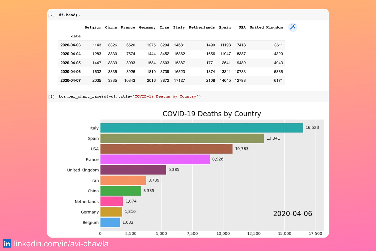
Ever seen one of those racing bar charts? Here's how you can create one in Python in just two lines of code.

A racing bar chart is typically used to depict the progress of multiple values over time.

To create one, you can use the "𝐛𝐚𝐫-𝐜𝐡𝐚𝐫𝐭-𝐫𝐚𝐜𝐞" library.

Its input should be a Pandas DataFrame where every row represents a single timestamp. The column holds the corresponding values for a particular category.

Read more: Documentation.

Watch a video version of this post on LinkedIn: Post Link.

Thanks for reading Daily Dose of Data Science! Subscribe for free to learn something new and insightful about Python and Data Science every day. Also, get a Free Data Science PDF (250+ pages) with 200+ tips.


Find the code for my tips here: GitHub.

I like to explore, experiment and write about data science concepts and tools. You can read my articles on Medium. Also, you can connect with me on LinkedIn.

6
Share this post

Create A Racing Bar Chart In Python

www.blog.dailydoseofds.com
Share
Previous
Next
Comments
Top
New
Community

No posts

Ready for more?

© 2023 Avi Chawla
Privacy ∙ Terms ∙ Collection notice
Start WritingGet the app
Substack is the home for great writing