
Don't Create Messy Bar Plots. Instead, Try Bubble Charts!
A Bar Plot may not always be an apt choice.

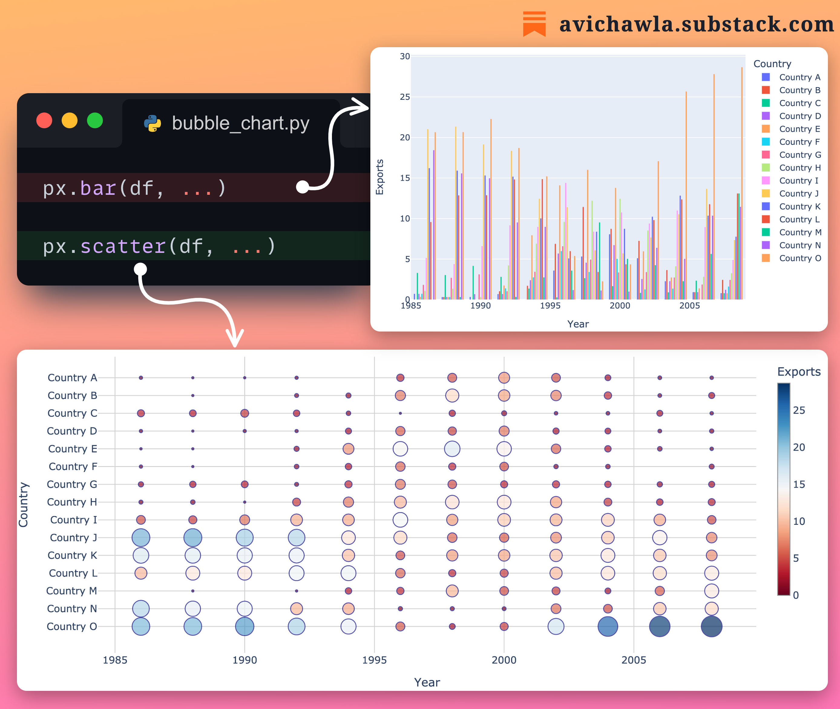
Bar plots often get incomprehensible and messy when we have many categories to plot.
A bubble chart can be a better choice in such cases. They are like scatter plots but with one categorical and one continuous axis.
Compared to a bar plot, they are less cluttered and offer better comprehension.
Of course, the choice of plot ultimately depends on the nature of the data and the specific insights you wish to convey.
Which plot do you typically prefer in such situations?
Share this post on LinkedIn: Post Link.
Find the code for my tips here: GitHub.
I like to explore, experiment and write about data science concepts and tools. You can read my articles on Medium. Also, you can connect with me on LinkedIn.
Thank you, great stuff-- I always recommend your work to other data scientists 👍🔥💕
What he said 👆