Daily Dose of Data Science

Share this post

Polynomial Linear Regression Plot Made Easy With Seaborn

www.blog.dailydoseofds.com

Polynomial Linear Regression Plot Made Easy With Seaborn

Avi Chawla
Nov 3, 2022
Share
Share this post

Polynomial Linear Regression Plot Made Easy With Seaborn

www.blog.dailydoseofds.com

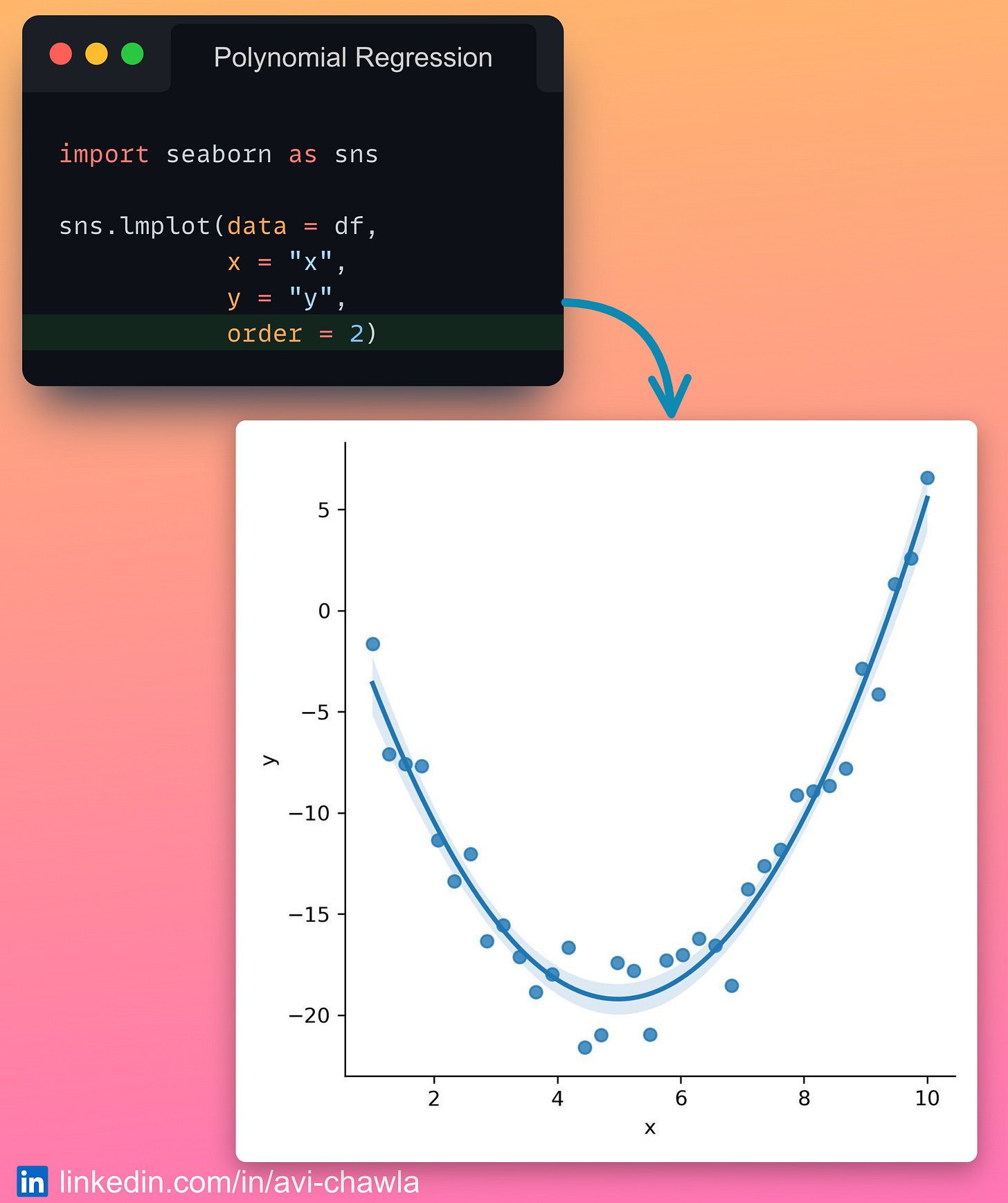
While creating scatter plots, one is often interested in displaying a linear regression (simple or polynomial) fit on the data points.

Here, training a model and manually embedding it in the plot can be a tedious job to do.

Instead, with Seaborn's ๐—น๐—บ๐—ฝ๐—น๐—ผ๐˜(), you can add a regression fit to a plot, without explicitly training a model.

Specify the degree of the polynomial as the "๐—ผ๐—ฟ๐—ฑ๐—ฒ๐—ฟ" parameter. Seaborn will add the corresponding regression fit on the scatter plot.

Read more here: Seaborn Docs.

Thanks for reading Daily Dose of Data Science! Subscribe for free to learn something new and insightful about Python and Data Science every day. Also, get a Free Data Science PDF (250+ pages) with 200+ tips.


I like to explore, experiment and write about data science concepts and tools. You could connect with me on LinkedIn.

Share
Share this post

Polynomial Linear Regression Plot Made Easy With Seaborn

www.blog.dailydoseofds.com
Previous
Next
Comments
Top
New
Community

No posts

Ready for more?

ยฉ 2023 Avi Chawla
Privacy โˆ™ Terms โˆ™ Collection notice
Start WritingGet the app
Substackย is the home for great writing