
Use Box Plots With Caution! They May Be Misleading.

Box plots are quite common in data analysis. But they can be misleading at times. Here's why.
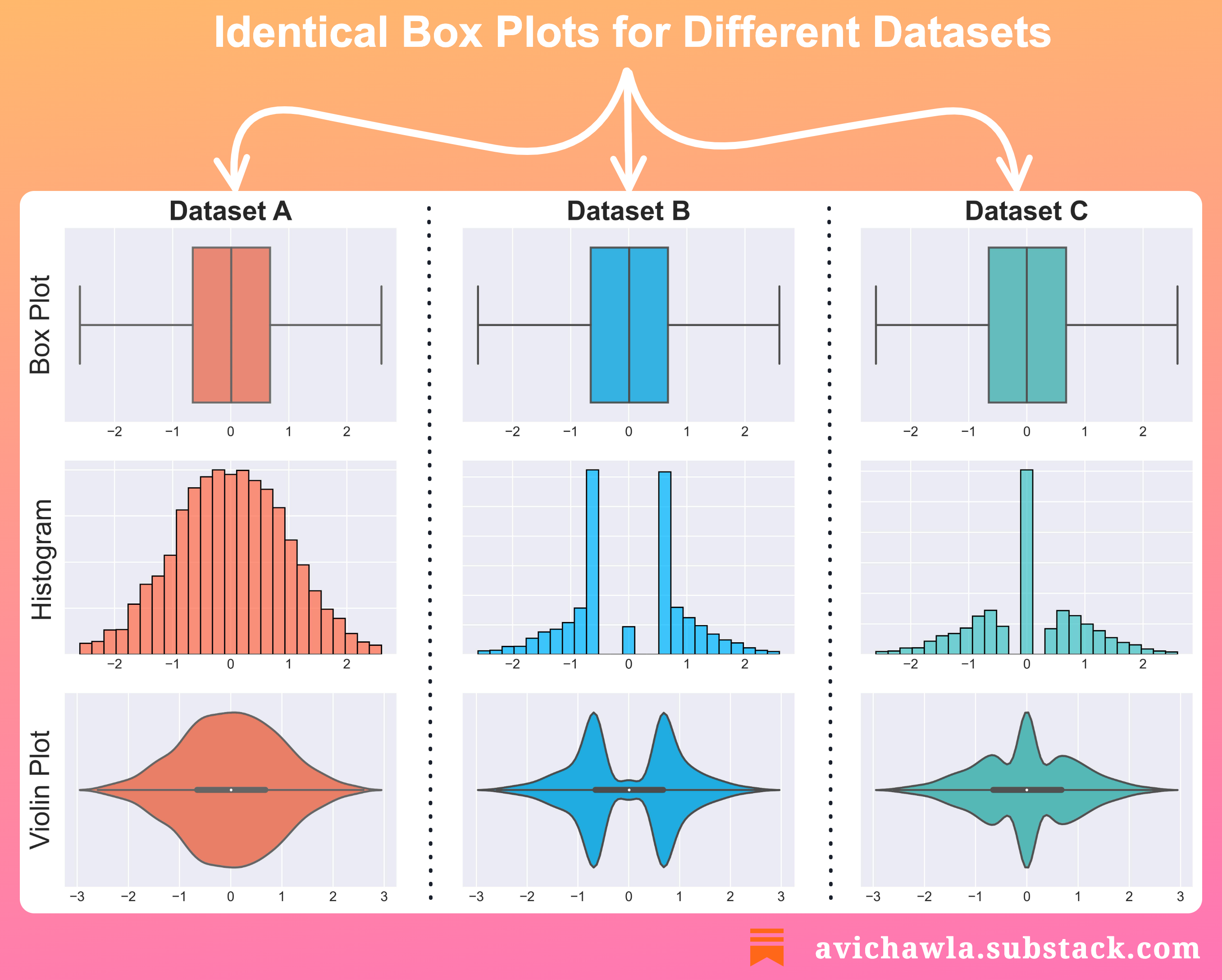
A box plot is a graphical representation of just five numbers – min, first quartile, median, third quartile, and max.
Thus, two different datasets with similar five values will produce identical box plots. This, at times, can be misleading and one may draw wrong conclusions.
The takeaway is NOT that box plots should not be used. Instead, look at the underlying distribution too. Here, histograms and violin plots can help.
Lastly, always remember that when you condense a dataset, you don't see the whole picture. You are losing essential information.
Share this post on LinkedIn: Post Link.
Mito, the no-code data spreadsheet, has started its data science blog. Do check it out here: Mito Blog.
Find the code for my tips here: GitHub.
I like to explore, experiment and write about data science concepts and tools. You can read my articles on Medium. Also, you can connect with me on LinkedIn.