Use Histograms With Caution. They Are Highly Misleading!
Instead, try these alternatives.
Histograms are commonly used for data visualization. But, they can be misleading at times. Here's why.
Histograms divide the data into small bins and represent the frequency of each bin.
Thus, the choice of the number of bins you begin with can significantly impact its shape.
The figure above depicts the histograms obtained on the same data, but by altering the number of bins. Each histogram conveys a different story, even though the underlying data is the same.
This, at times, can be misleading and may lead you to draw the wrong conclusions.
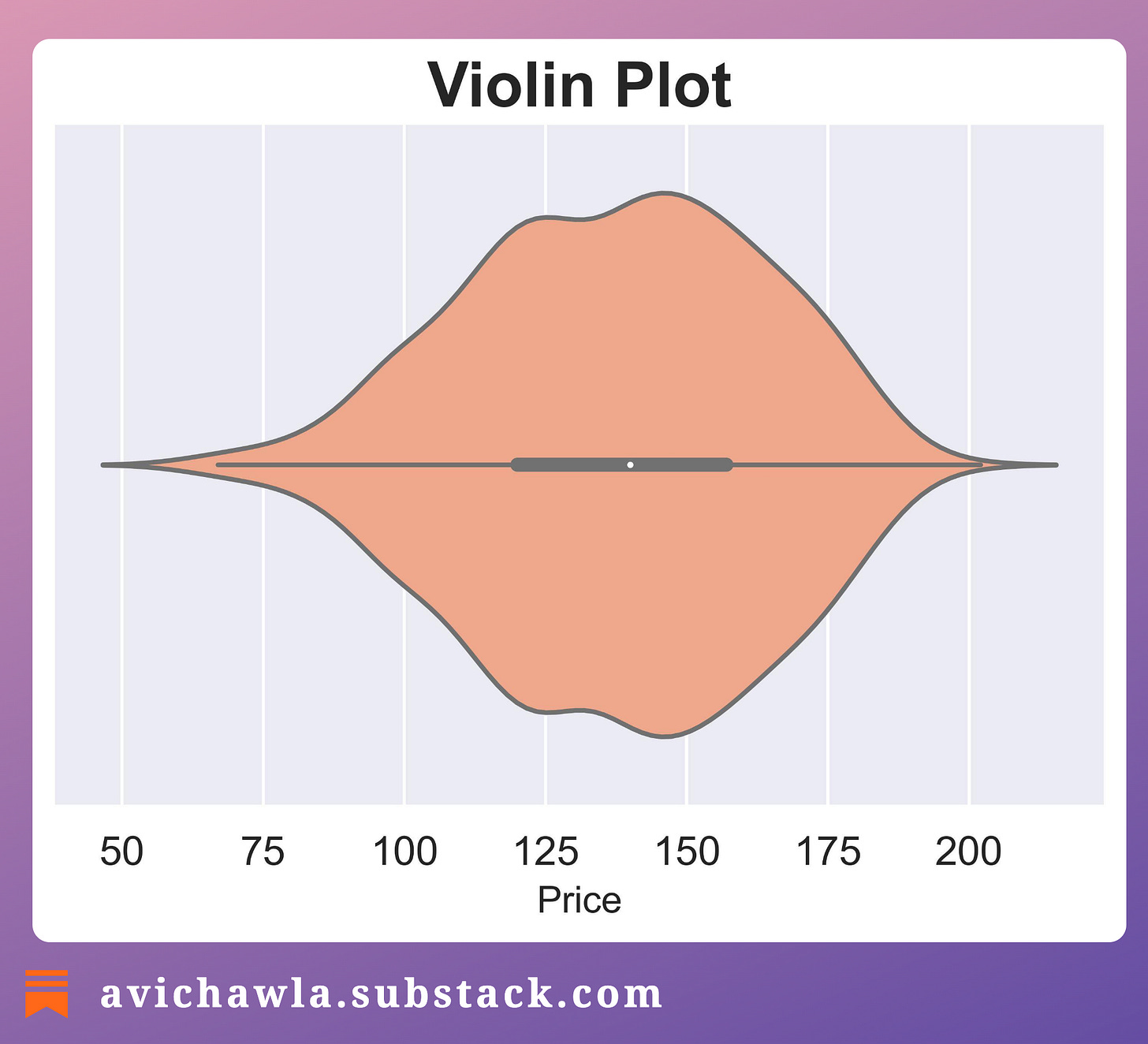
The takeaway is NOT that histograms should not be used. Instead, look at the underlying distribution too. Here, a violin plot and a KDE plot can help.
Violin plot
Similar to box plots, Violin plots also show the distribution of data based on quartiles. However, it also adds a kernel density estimation to display the density of data at different values.
This provides a more detailed view of the distribution, particularly in areas with higher density.
KDE plot
KDE plots use a smooth curve to represent the data distribution, without the need for binning, as shown below:
As a departing note, always remember that whenever you condense a dataset, you run the risk of losing important information.
Thus, be mindful of any limitations (and assumptions) of the visualizations you use. Also, consider using multiple methods to ensure that you are seeing the whole picture.
👉 Read what others are saying about this post on LinkedIn.
👉 Tell me you liked this post by leaving a heart react ❤️.
👉 If you love reading this newsletter, feel free to share it with friends!
Find the code for my tips here: GitHub.
I like to explore, experiment and write about data science concepts and tools. You can read my articles on Medium. Also, you can connect with me on LinkedIn and Twitter.


