
Raincloud Plots: The Hidden Gem of Data Visualisation
...that very few are talking about.

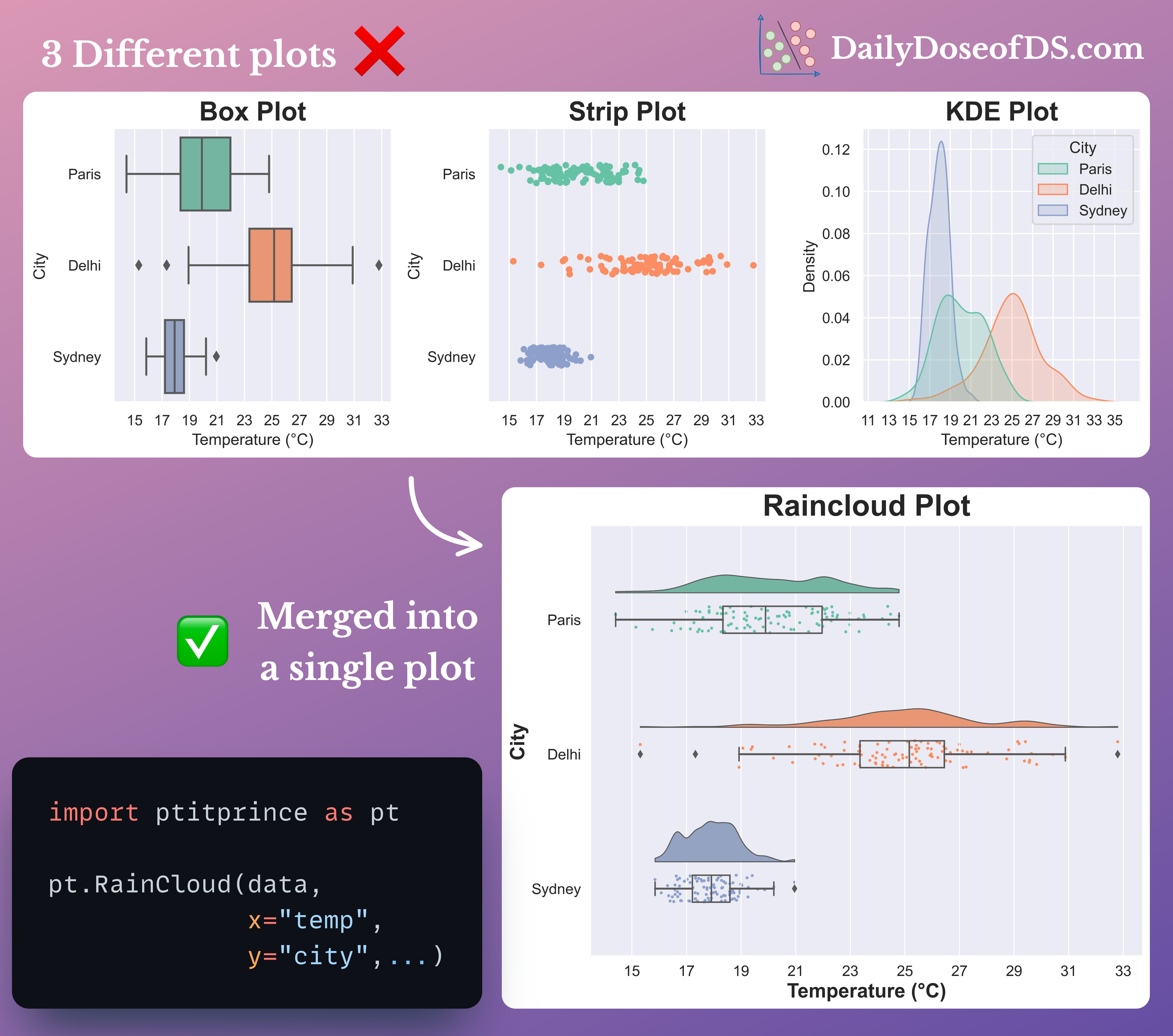
Visualizing data distributions using box plots and histograms can be misleading at times.
This is because:
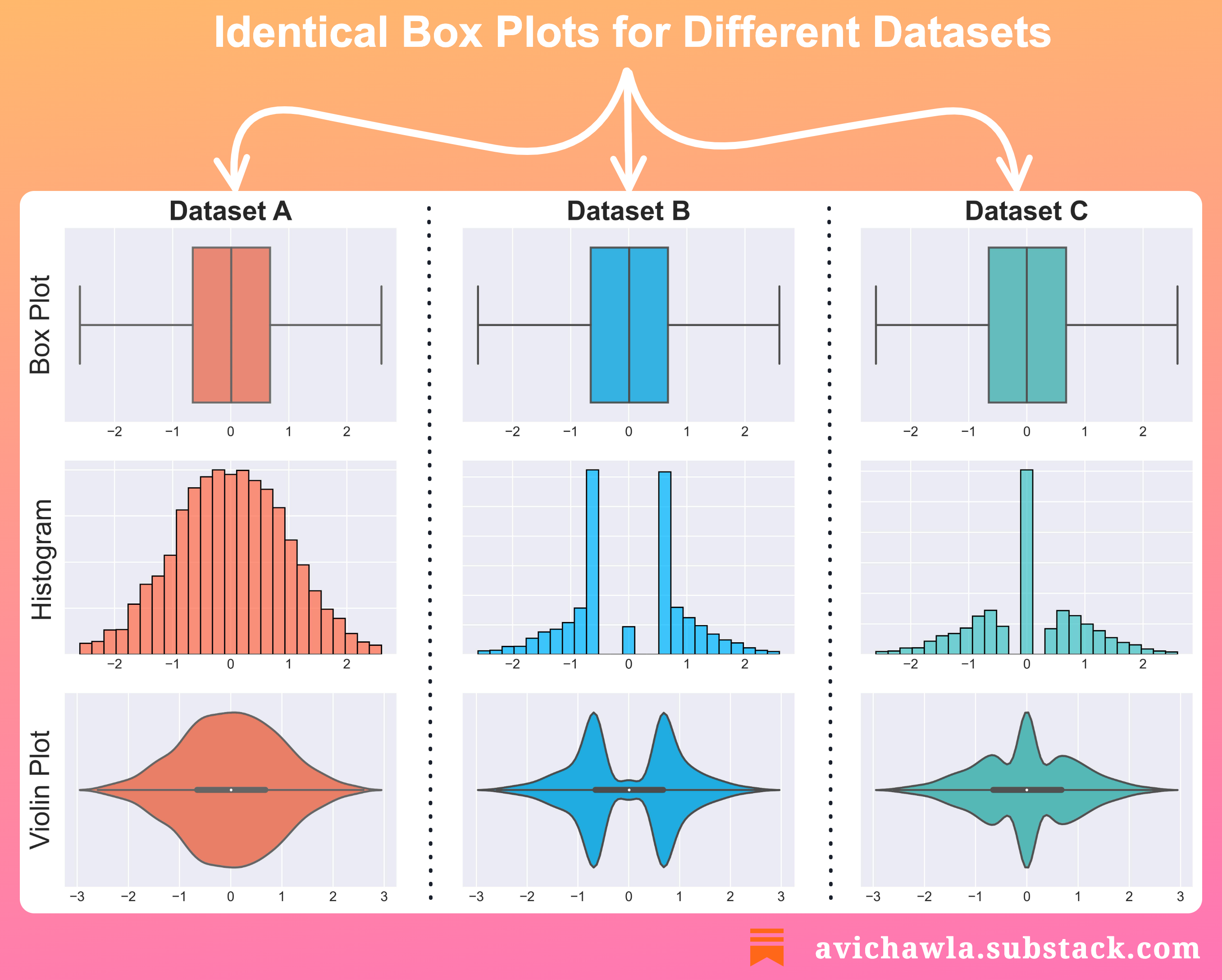
It is possible to get the same box plot with entirely different data.
For instance, consider the illustration below from one of my previous posts: Use Box Plots With Caution! They May Be Misleading.

We get the same box plot with three different datasets.
Altering the number of bins changes the shape of a histogram.

Thus, to avoid misleading conclusions, it is recommended to plot the data distribution.
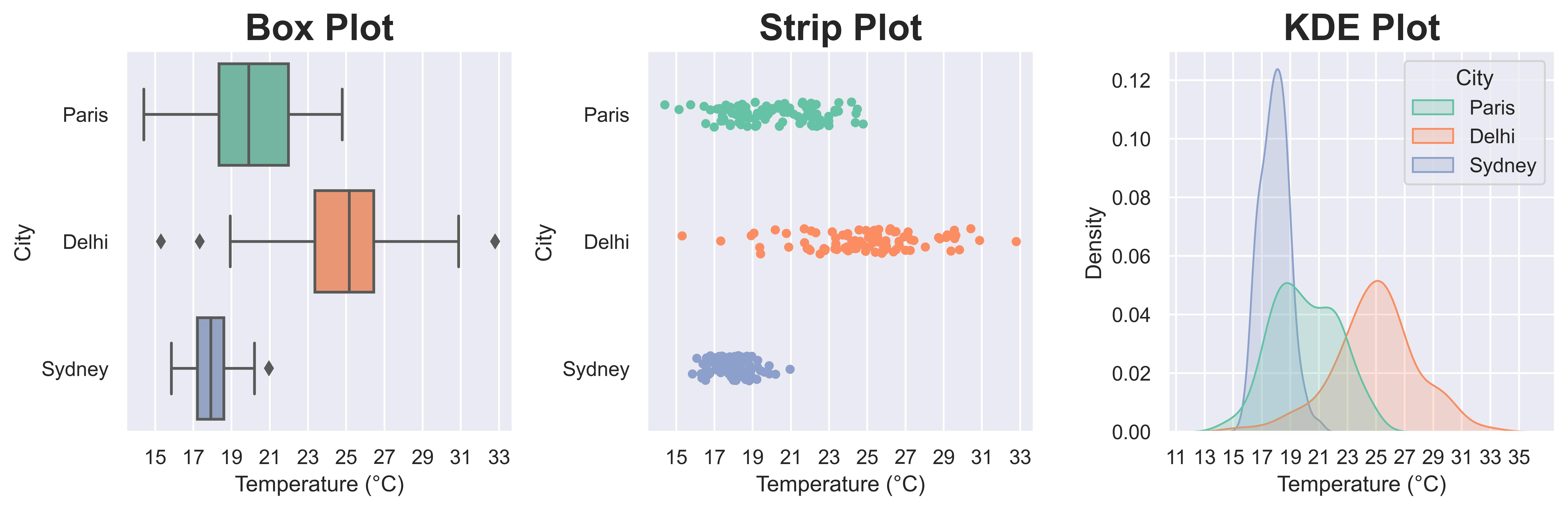
Here, jitter (strip) plots and KDE plots are immensely helpful.
One way is to draw them separately and analyze them together, as shown below. But this is quite tedious.
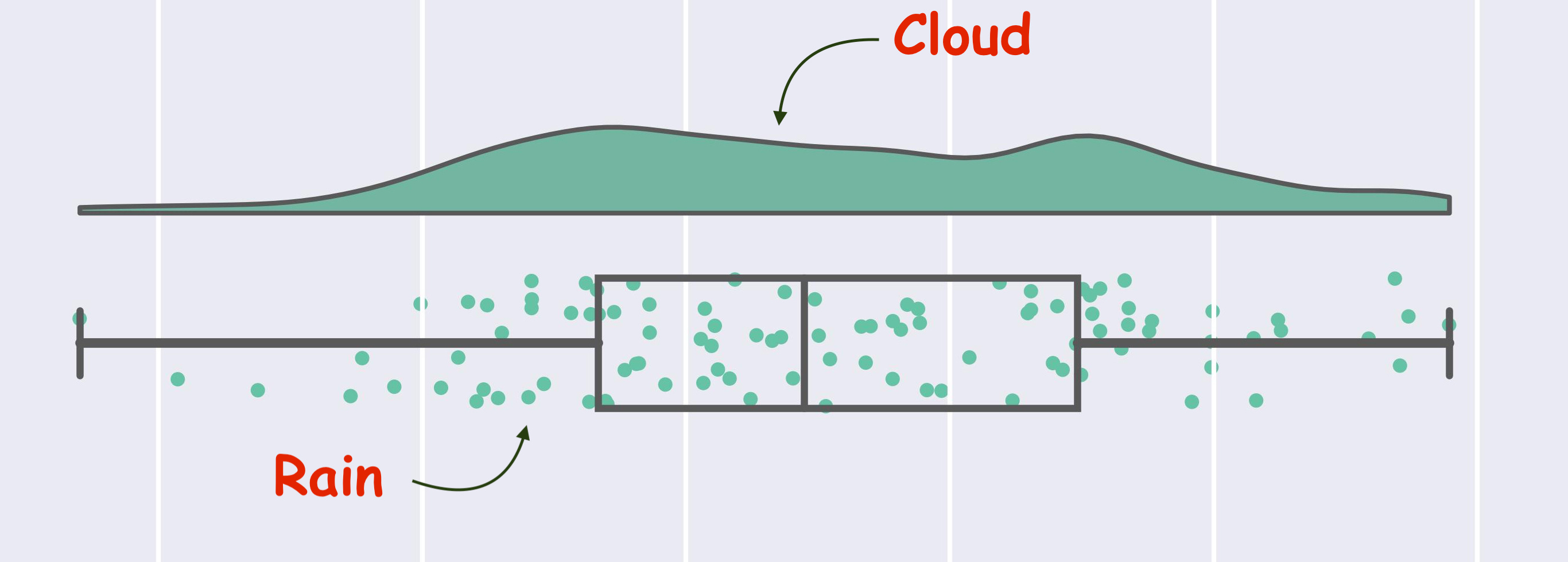
Instead, try Raincloud plots.
They provide a concise way to combine and visualize three different types of plots together.
These include:
Box plots for data statistics.
Strip plots for data overview.
KDE plots for the probability distribution of data.
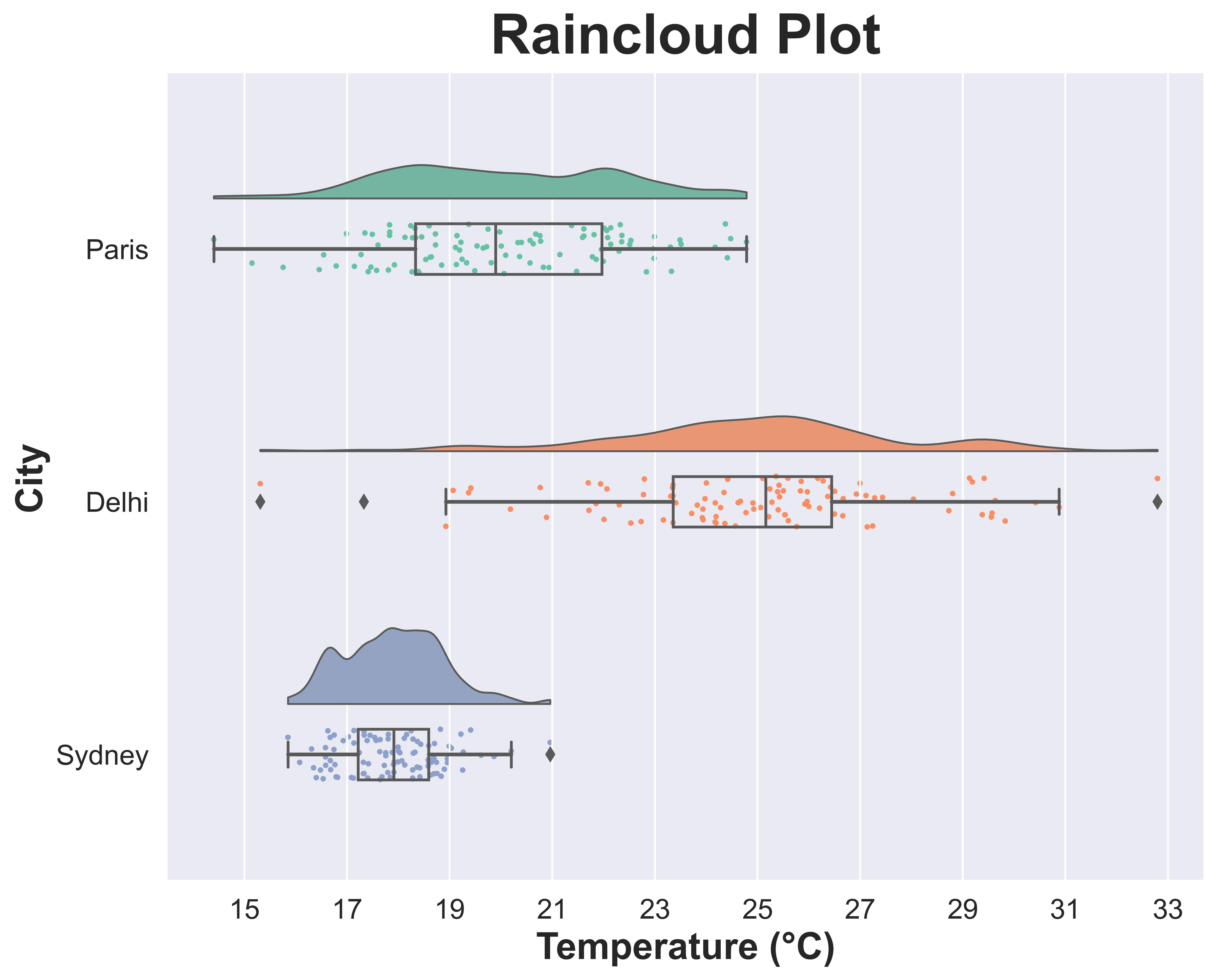
Overall, Raincloud plots are an excellent choice for data visualization.
With Raincloud plots, you can:
Combine multiple plots to prevent incorrect/misleading conclusions
Reduce clutter and enhance clarity
Improve comparisons between groups
Capture different aspects of the data through a single plot
You can use the PtitPrince library to create Raincloud plots in Python: GitHub.
R users can use Raincloud Plots library: GitHub.
P.S. If the name “Raincloud plot” isn’t obvious yet, it comes from the visual appearance of the plot:
👉 Over to you: What are some other hidden gems of data visualization?
👉 If you liked this post, don’t forget to leave a like ❤️. It helps more people discover this newsletter on Substack and tells me that you appreciate reading these daily insights. The button is located towards the bottom of this email.
👉 Read what others are saying about this post on LinkedIn and Twitter.
👉 Tell the world what makes this newsletter special for you by leaving a review here :)
👉 If you love reading this newsletter, feel free to share it with friends!
👉 Sponsor the Daily Dose of Data Science Newsletter. More info here: Sponsorship details.
Find the code for my tips here: GitHub.
I like to explore, experiment and write about data science concepts and tools. You can read my articles on Medium. Also, you can connect with me on LinkedIn and Twitter.